I was requested with the team to figure out some styles for the background,in addition, I took it upon myself to get into figuring out the props too (ie. the trees, cactus, signs,cactus etc)


Following the comments last week,


I went with the fourth design of the gun and coloured it in a plastic-like way so that it would look like a water gun and not a real gun.

In terms of colour, the client likes no.5 so I incorporated it into the 4th variation of the design.
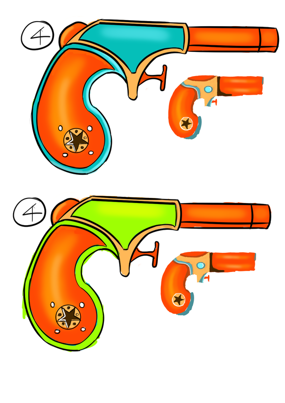
I incorporated that colour scheme into design no. 4 and it was requested to change the colour to NEON green. Initially, I was rather apprehensive about it as it seems reallly a bad choice (I personally hate neon green) , unfortunately, he likes it....and he requested to add in the colour 'purple'....
In conjunction, my team mate asked me to get rid of the orange highlight of the hilt, and make the green less glaring and darker....Since I can't satisfy everyone in one design, I made a compilation of the different choices with the different requests:
In conjunction, my team mate asked me to get rid of the orange highlight of the hilt, and make the green less glaring and darker....Since I can't satisfy everyone in one design, I made a compilation of the different choices with the different requests:

Eventually, the client selected no. 7...I don't particularly like it, but hey the client is the client.
 RSS Feed